How do you add a modern look and contemporary conventions to a circa 1875 home perched on a steep cliff while keeping essential elements of its historic beauty?
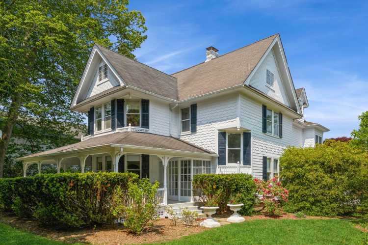
That’s the challenge that The Up Studio took on when renovating a historic 3,600-square-foot Second Empire Victorian home in Sea Cliff, which they completed early this year.
“We could tell that the house was beautiful and had really beautiful bones and some really great details to it, but it was fairly beat up and dilapidated when we first looked at it,” notes Jeffrey Ramirez, partner and brand designer for The Up Studio, a Long Island City-based architectural firm which does a mix of new home designs and renovations from the Hamptons to Hudson Valley.
The design process for the project, which Ramirez et al dubbed, “Cliff & Cove House” took six months; the actual renovation: just about a year.
“It had a lot of twists and turns and extra walls that weren’t conducive to modern living,” Ramirez says. “So, the family — a young family with two young kids — were looking to make it modern and a better fit for their lifestyle.”
Melding Old With New
Unlike today’s open floor plan concept, Victorian homes were designed for compartmentalized living, with a larger number of smaller, separate rooms.
“Particularly kitchens used to be walled off as a place where the work would happen and the socializing would happen in the dining room,” Ramirez says.
The owners of Cliff & Cove House wanted to live in a home where cooking, eating and chilling could be done together.
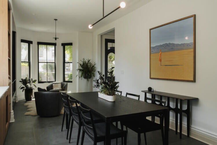
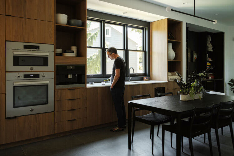
“One of the things we did was open up what we call a ‘gathering space,’ which is the kitchen/dining and a little seating area we built out, with custom cabinetry and custom millwork,” says Ramirez, adding that the kitchen has walnut cabinets, marble counters and backsplash, and a dark porcelain tile floor covers the entire space.
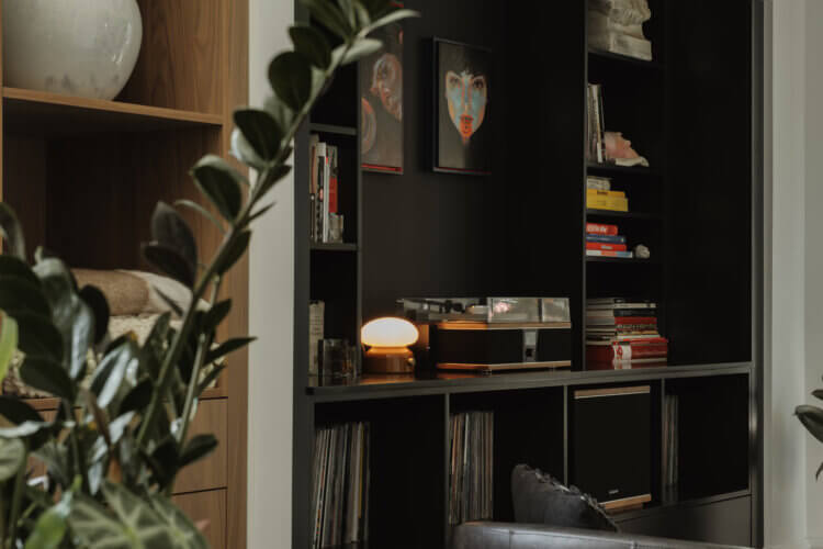
“It’s essentially one wall that slides from their kitchen cabinets to a coffee bar station and flows really nicely into an area for them to store their records and some of their amazing art collection.”
The Up Studio designed a custom black shelving system to fit the family’s records and some pieces of art to showcase there.
“There are also a few walls that we intentionally left open because we knew that the homeowner had some larger pieces that they wanted to display,” Ramirez says.
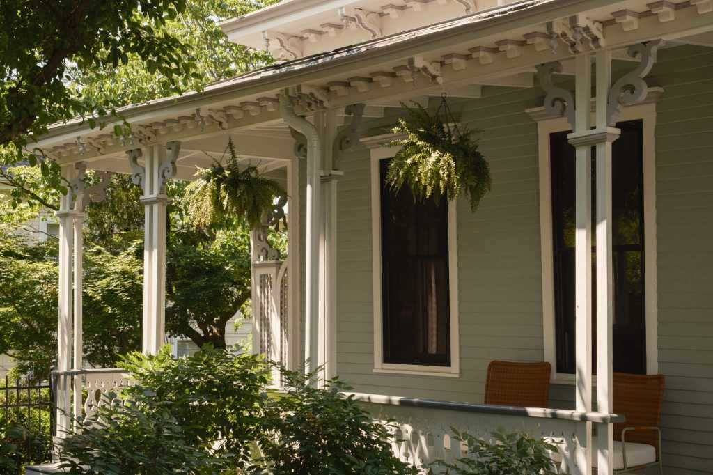
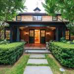
The designers kept intact but refreshed many of the home’s original features, such as the original Southern yellow pine flooring and the exterior ornamental Victorian touches, including the slate-tiled mansard roof and bracketed cornices, columns, and railings on the inviting wraparound front porch.
“There was definitely refinishing but everything down to the front door is the original,” Ramirez says.
Opening Walls, Conquering Challenges
Some of the greatest challenges Ramirez and his team faced were in trying to integrate historic details in the new design while making the space fit for modern living.
“We like to play with this idea of old versus new and we think in that contrast some beauty really comes out,” says Ramirez, adding, “You’re always crossing your fingers about what you’re going to learn when you open up walls.”
One issue was figuring out how to preserve the exquisite stair and railing at the center of the house.
“It definitely took a little bit of work to make sure we could get the right-sized bedroom at the top of the stairs, keeping that stair in the same location,” Ramirez says.
Previously a maze of doors and walls, the second-floor landing is now filled with light from nearby windows and leads to three bedrooms, an office and two bathrooms.
“What used to feel like a pretty dark corridor of turning doors now does feel like a light-filled space with some pretty clean geometry and plants and art,” Ramirez says.
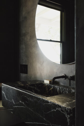
One of Ramirez’s favorite spaces is the powder room off the gathering space whose focal points are a circular mirror over a custom black marble floating vanity and dark walls with a micro-cement finish.
“It’s this idea almost of compression, so it almost makes that space feel a little smaller than it is, but the mirror and the window in there bring your eye and your attention out to the view of the incredible harbor,” Ramirez explains.
Also presenting a design challenge, the primary bathroom now has part of an original curved wall that gives the homeowners ample space in their primary bedroom as well as their bath.
“That wall was a response to some of the home’s original structural details,” Ramirez says.
A Home With a View
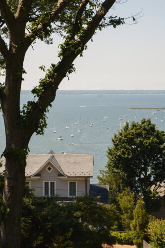
One of the goals in the redesign was to open up the views out back to Hempstead Harbor.
“It was definitely intentional in our design that when they’re making a cup of coffee or prepping a meal that they can always be glancing back out to the harbor which really connects them to the incredible location,” Ramirez says.
The original small, punched windows were replaced with larger, distinctive, black-framed Pella windows.
“We were able to open that and really capture those views, particularly in the rear living room which is a corner that opens up to that rear deck that really invites you out onto that back deck overlooking the harbor,” Ramirez says.
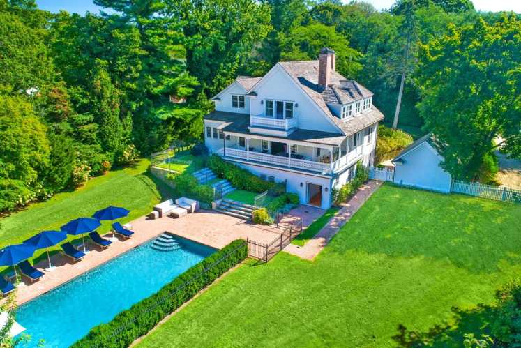
Sited on a quarter-acre, the home is on ground level in front, with the grade changing dramatically as you move towards the back. When you reach the back deck, there’s a precipitous 25-foot drop-off below.
“When you’re out on that deck, it really feels like you’re floating up above the harbor,” Ramirez says.
Part of the overall design was to open the interior spaces to draw your eye and attention outward.
“The view of the harbor captures you from almost anywhere inside the house,” Ramirez says.
This article appeared in the November 2023 issue of Behind The Hedges Powered By the Long Island Press. Read the full digital edition. For more on Long Island real estate on Behind The Hedges, click here.
